

Today Laura is sharing a Solving Visual Unrest Case Study.
She demonstrates her approach to addressing design dilemmas by revisiting and remaking an previous layout design.
This tutorial is conducted in Photoshop Elements 14 but you can follow along in the version of your choice.
Solving Visual Unrest
Introduction
The design dilemma.
- Laura says, “I never really liked the original layout of my daughter harvesting her first crop of peas.”
- For the peas to become focal point, the size of my daughter’s hand became too large.
- Downsize the hand and the peas are too small.
- So I left it and said “good enough” but the design bothered me enough to come back a few weeks later to explore other options.
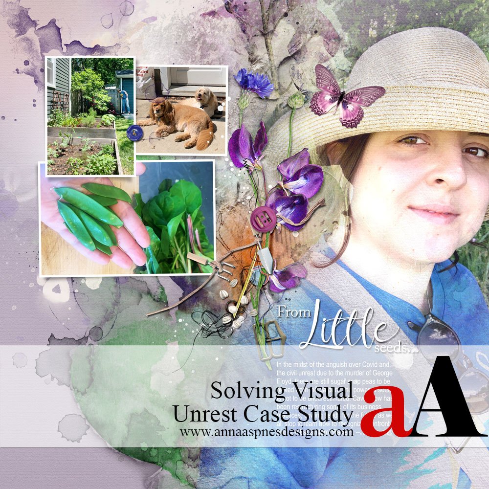
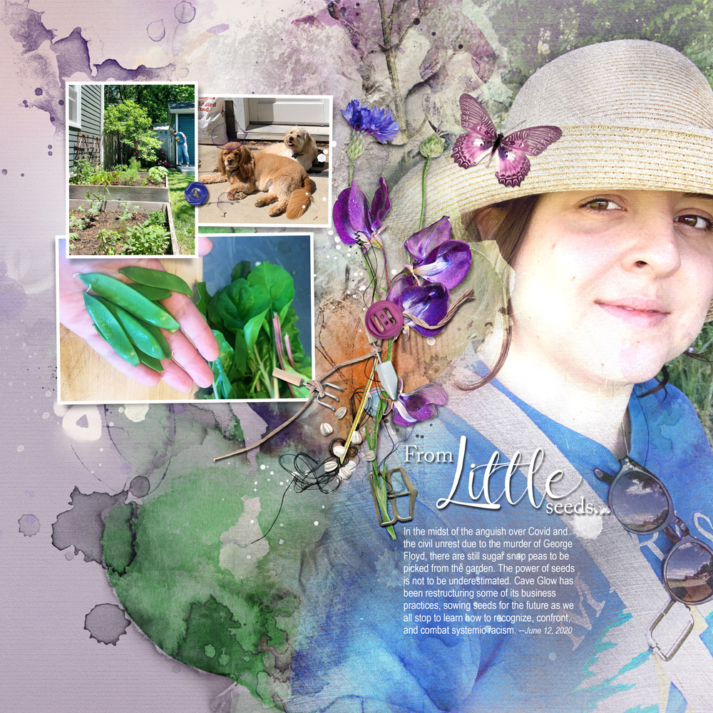
BEFORE
AFTER
With fresh eyes.
- After looking at the layout, I realized the problem was that my design had two focal points—my daughter’s hands and my daughter’s face.
- This created visual unrest.
- And it was time to make it right.
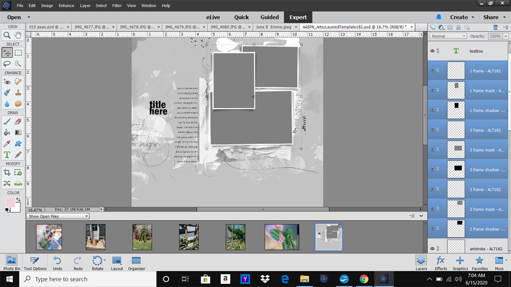
1. Deconstruct to Reconstruct
Remove the elements that do not work.
- A redo does not necessarily mean a total rip up.
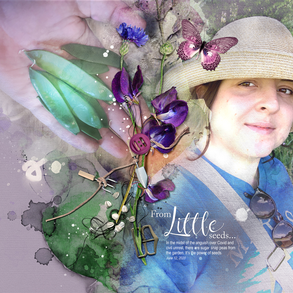
- My deconstruction involved removing only the blended photo of the hands and peas.
- This left the large photo of my daughter as the sole focal point.
Add them back to the design using a different approach.
- But how to add back the photo of the peas?
- Part of the problem with the first layout was that the two blended photos fought for attention.
- The large blended photo was replaced with a smaller cluster of frames.
- The sharp edges of smaller frames provide contrast well with the organic lines in the blended image.
- Supporting photos were introduced to the frame cluster with the original photo of the peas.
Note. You could also use ArtsyKardz or digital papers in the absence of supporting photos.
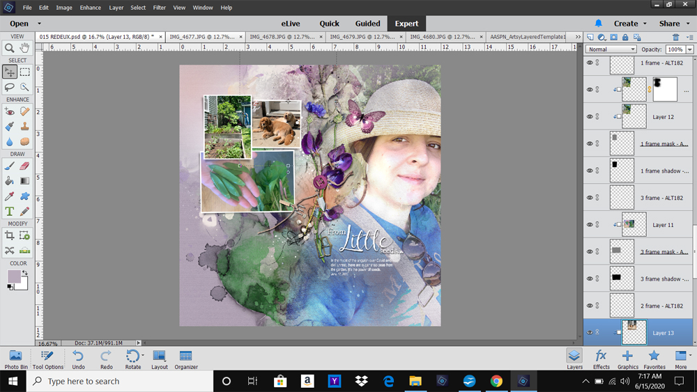
2. Adding Visual Elements
Save time with the ‘re-use and re-cycle’ concept.
- A frame cluster was ‘borrowed’ from an Artsy Layered Templates.
- This negated the need for to create one.
- The element was selected based on the Number and Orientation of the supporting photos.
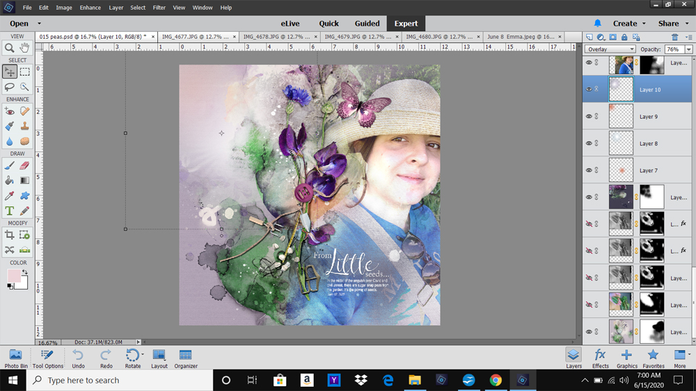
- Select ALL the frame layers in the template in the Layers Panel and arrange on your layout design.
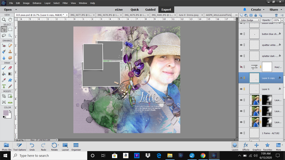
- Clip the photos to the mask layers in the frame layers using the Clipping Mask Function.
3. Embellishment
Modify original elements and add some new ones to support the design.
- All the embellishments in the original layout were used in the remake but with Modification.
- The MultiMedia Flowers were Reduced in Size to better support the frame cluster.
- This element was also Repositioned so it would not obstruct the frames.
- The title was duplicated with Color Dodge Blending Mode applied with a stronger Drop Shadow Layer Style for emphasis.
- The addition of brushwork completes the design.
DigitalART Supplies
Find a full list of aA DigitalART used in this layout here.
Summary
Go back to the basic design principles to help your determine the source of visual unrest.
- When a layout doesn’t work it, a Violation of a Simple Design Principle can be the cause.
- Don’t be Afraid to go back into the design and make it right.
- Once you identify the problem, The Solution can be a case of a few easy modifications
Note. You may also find visual unrest might be found in:
- A lack of Contrast.
- Colors that are not harmonious.
- Absence of Tension.
- Missing Movement.
Also See.
- Element Properties and Design Principles
- Adapting Colorful Artsy Layered Templates
- Master Design Using Templates
AND IF YOU LIKED THIS USE Solving Visual Unrest Case Study, PLEASE CONSIDER SHARING USING THE SOCIAL MEDIA BUTTONS BELOW.


Laura, this tutorial is excellent….I’ve experienced this problem and sometimes am successful at remaking the layout, other times not. You’ve explained the problem and solution so clearly with wonderful visual screenshots! Thank you very, very much!
Happy it helped Beverly!
Thanks so much Beverly. The big takeaway for me is that when I don’t like something, it’s usually because I’ve unwittingly violated a design principle. So I put on my diagnostic hat and once I figure out the problem, the solution is usually not far behind. It was a really interesting realization to come to, and I’m glad that sharing it was helpful. Thanks for letting me know!